Read about czerasz.com new logotype. In this article you can follow the logotype creative process - from keywords through associations to achieve a new logotype.
Today I have an important announcement: the website czerasz.com got a fresh face. We created a new logotype which respresents the things we believe in. Ladies and gentlemen here is the brand new appearance of czerasz.com:
We thought that some of you might be interested in the paths which we followed to reach this goal.
One of the methods which apeared for us to be efficient during a creative process is mind mapping. The method as efficient as it is brings additionally a huge fun factor. It’s very simple - during a brainstorming session start with a single keyword and continue with others which are related. Watch out, it can quickly get very complex as shown in this example. To be sure that your map is always readable use the right tool like mindmeister.com or lucidchart.com.
The mind map below visualises the path from brand attributes, various associations to finally achieve the logotype we love.
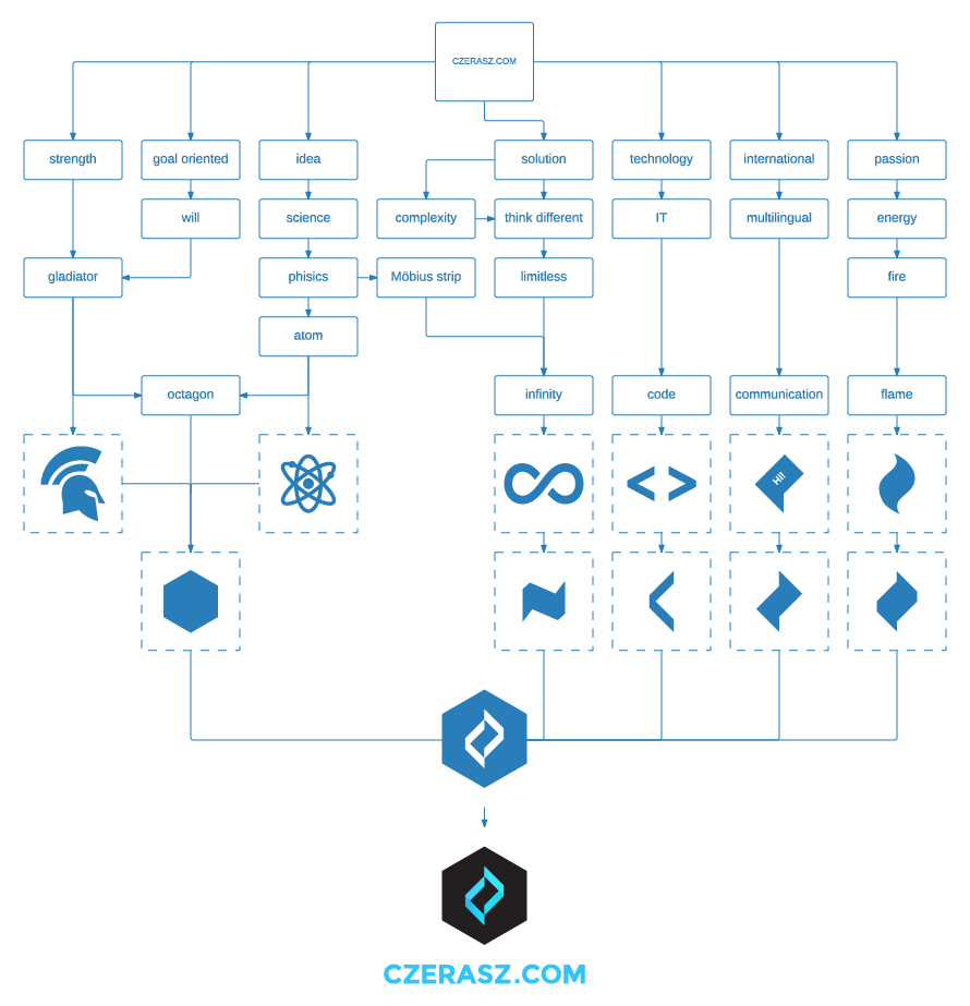
During this process we used the following keywords:
strength gladiator goal oriented will idea science phisics Möbius strip atom octagon solution complexity think different limitless infinity technology IT code international multilingual communication passion energy fire flame
We analysed word after word, trying to find something on the abstract field. Something that has a clear shape and meaningful appearance. Finaly after several tries and failures we found the basic shapes:
- octagon represents our warrior nature, the nature to achieve… through a scientific approach
- infinity means for us that impossible is nothing
- code says that we are technology driven, that everything IT related fascinates us
- communication is our basic tool, whose importance we weight with the chandrasekhar limit
- flame stands for our passion, our will to lighten the internet sky more than a supernova
Building on those entities we were able to combine the shapes into one clear homogeneous logotype.
You can find the above diagram/mind map also as a PDF version here.
The whole process was more complex but we wanted to share at least a part of it with you. The one which we think is the most important.
Resources
- icons for the infographic were taken from iconmonstr
- icons for the infographic were made by Dave Gandy, Freepik from www.flaticon.com is licensed by CC BY 3.0
